

Redefining Our Identity: The Vision Behind Our Brand Refresh
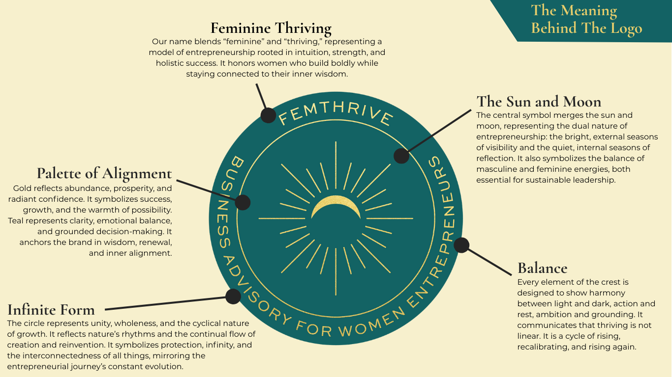
As FemThrive continues to evolve, it felt essential that our visual identity evolve with us. Today, we’re excited to share the updated Femthrive logo: a symbol that captures the full spectrum of what it means for women to build, lead, and thrive on their own terms.
Our brand refresh isn’t just about chasing trends or making things “prettier.” It’s about alignment, a deeper expression of who we are and what we stand for.
A logo is more than a symbol. It’s the first impression, the emotional cue, and the anchor for everything a brand stands for. Our previous logo served us well, but it represented an earlier stage of our identity. As our work deepened, we needed a mark that captured:
Clarity and confidence
A sense of movement and growth
A modern, elevated aesthetic
A visual identity that resonates with our audience today
The refreshed logo does exactly that. Its clean lines and intentional structure reflect the strategic foundation behind our work, while its energy and shape communicate momentum, the kind of forward motion we help our clients create.
A Website Designed for the Next Level
Your website is your digital home, and ours needed a renovation. Not because it was broken, but because it no longer matched the sophistication, clarity, and depth of what we offer. The new site was built with three priorities in mind:
1. Simplicity and ease of navigation
Visitors should immediately understand who we are, what we do, and how we can help. The updated layout removes clutter and makes the user journey intuitive.
2. A stronger expression of our brand personality
From typography to color palette to imagery, every element now reflects the confidence, warmth, and professionalism that define our work.
3. Clear pathways to action
Whether someone wants to learn more, join a program, or connect with us directly, the new site guides them there seamlessly.
Why This Refresh Matters and What’s Next?
A brand isn’t static. It grows as you grow. It evolves as your audience evolves. And when done intentionally, a brand refresh becomes a powerful signal:
That you’re leveling up
That you’re committed to excellence
That you’re ready for bigger opportunities
That you take your identity, and your impact, seriously
This refresh marks the beginning of our next chapter, not the end of the last one. It’s a foundation we’ll continue to build on as we expand our offerings, deepen our community, and step into the future with clarity and purpose.
The new logo and website are just the start. Over the coming months, you’ll see this refreshed identity reflected across our content, programs, and partnerships. We’re excited to share more, and even more excited for what this evolution makes possible.